Useful Links
Services
Contact
- We work for you
- (+1) 4438950611
- grow@asapcannabismarketing.com

website_dev
November 15, 2023

With marijuana legal, or at least not a punishable offense, in nearly half of all US states, it’s fair to assume we’re only seeing half of what its demand is going to be once the remaining states wake up, smell the cannabis, and allow their people to harness it for personal or commercial use.
In fact, why are we even talking about the future? As things stand, the cannabis industry is already so massive that businesses need all the help they can get to stand out and attract more customers.
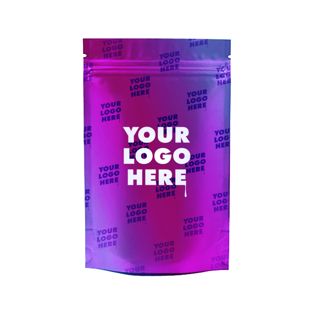
A large part of that is down to innovative digital advertising. However, you should never underestimate the power of a solidly packaged product. Like most products, cannabis needs packaging, and not just any packaging; you need the kind adopted after applying rigorous branding strategies. Tap here to see what we mean.
Or you can keep reading for the dos and don’ts of product packaging design in this industry.
Keep an ear out for the ever-changing cannabis packaging regulations in your region. The packaging policies for Nevada, for instance, could be different from the packaging regulations for Connecticut.
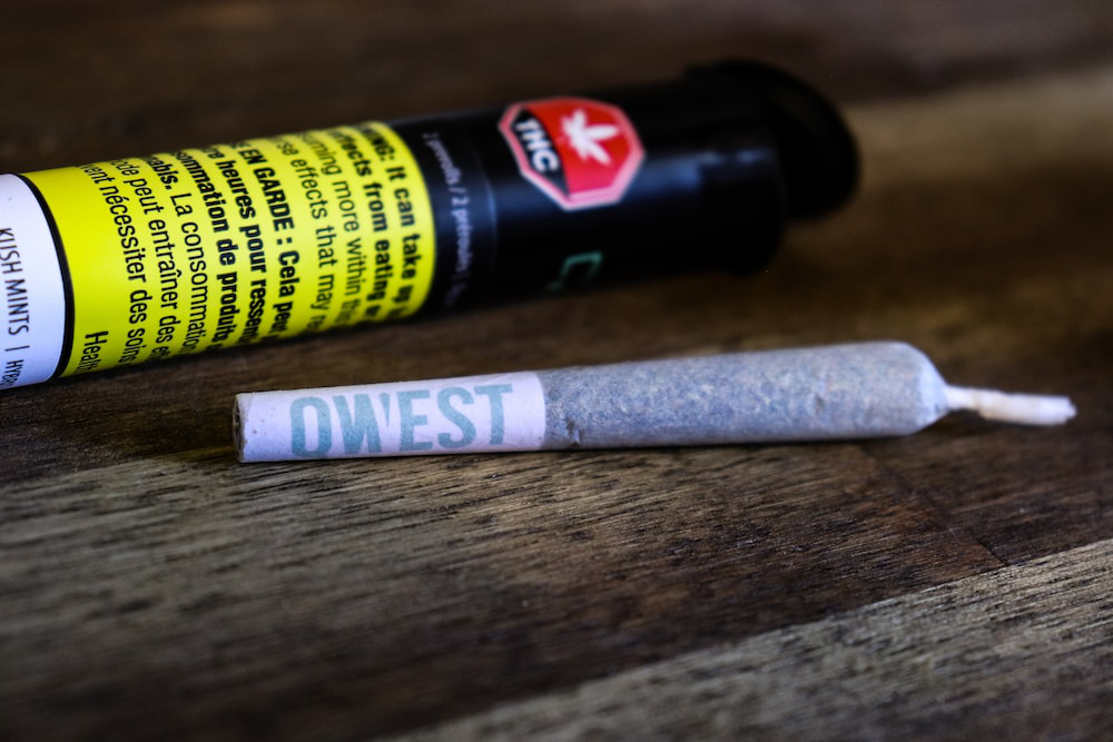
Your product packaging must adhere to all relevant laws, including child-resistant features, labeling requirements, and other restrictions. Being on the right side of the law is crucial not only for avoiding legal issues but also for building trust with consumers who expect a responsible and compliant industry.

Avoid overcrowded designs with excessive text, images, and information. Cluttered packaging can overwhelm consumers, making it difficult for them to quickly grasp the product’s key information. Simplicity and elegance often work best.
Also, it’s important to say less with more when it comes to cannabis products. We understand that you may want to warn your consumers about the potential side effects, but those can be printed inside a leaflet and left inside the packaging.
You don’t want to make a negative first impression for any reason when it comes to something that still gets unnecessary flak from policymakers.
Let your packaging design be an extension of your marijuana brand’s identity. Consider the colors, fonts, and imagery that best represent your company’s personality and values, and then maintain them over the years so that your returning customers can tell you apart from your design elements alone.
Consistency in design across all cannabis products helps build brand recognition and loyalty; that is the one thing these brands have in common with all the other brands dealing with edible products.
That said, consistency follows creativity, which is the first thing you must nail to create a brand identity worth people’s time and money.

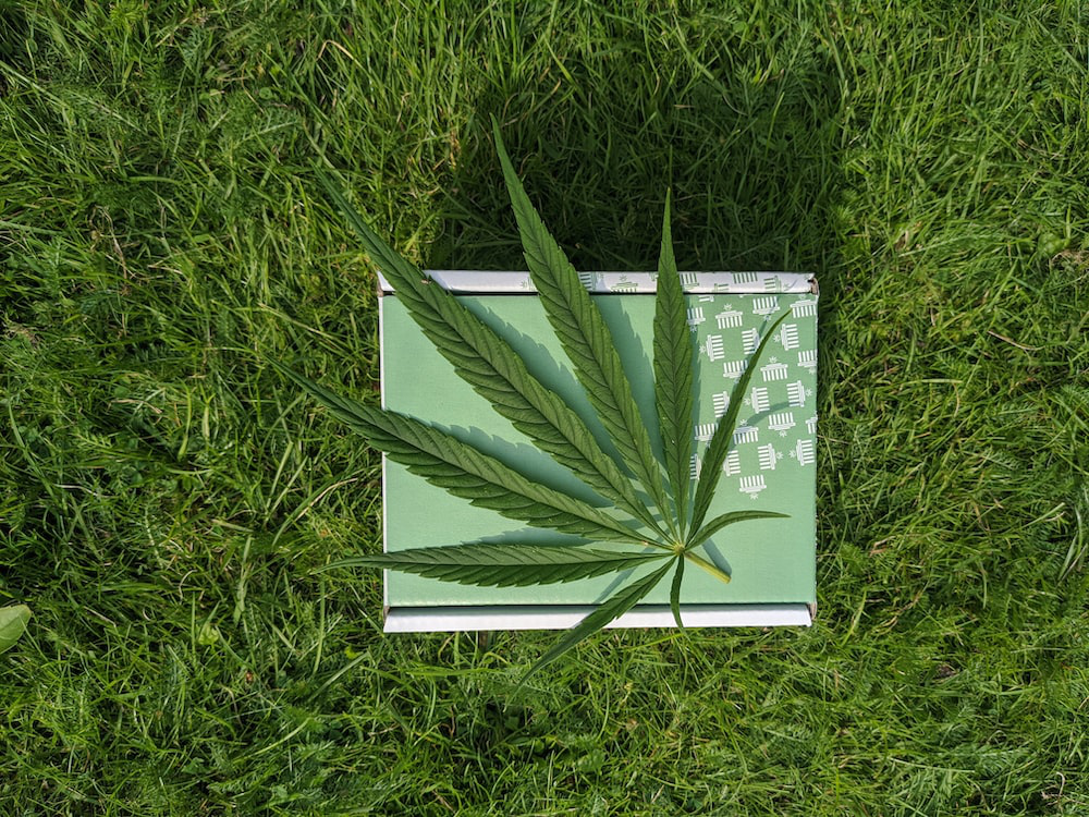
While cannabis leaves and symbols are relevant, don’t overdo it. Excessive use of clichéd cannabis imagery can make your product look unprofessional and appeal to a limited audience. Strive for a balance between relevance and sophistication.
For inspiration, look at what the most famous marijuana brands are doing, packaging-wise. We mean, they’re clearly getting it right, or their products wouldn’t be flying off the shelves. Many, like Verano, aren’t even putting a marijuana leaf on their product packaging. They are letting color and font do the talking, which is how it should be done.
Essential product information, such as the product name, THC/CBD content, usage instructions, and any allergy warnings, should be presented clearly and transparently. You can have detailed versions of this information inside the packaging, but the most important and basic information needs to be out front and center for everyone to see.
By doing this, you comply with packaging regulations for cannabis products, and your transparency allows you to build trust with consumers, who are able to make informed choices because of your due diligence.
Colors play a vital role in packaging design. The psychology of color is a fascinating and powerful aspect of marketing and branding. It’s all about understanding how different colors evoke specific emotions and perceptions in consumers and then using this knowledge to influence their behavior.
Most cannabis products are green because the color is closely linked to nature, health, and freshness. It’s used in packaging to convey organic, eco-friendly, and sustainable qualities.
Think about the message you want to convey—the identity you want to embrace—and select your color accordingly.
Moreover, avoid color schemes that clash or make text illegible. For instance, people with color blindness may not be able to read text if it’s a different shade of the same color as the background.
Always consider readability and visual harmony, and choose colors that resonate with your brand’s identity and values.

Make it easy for consumers to access and use your product. Ensure your packaging is user-friendly, with features like resealable zippers, tear strips, or clear instructions on how to open the package.
A positive user experience enhances brand credibility and customer retention; it doesn’t have to occupy too much space. Just look at all the big-name products, such as M&M’s or Hershey’s, who are doing the same thing.
Their delicious flavor wasn’t the first thing those initial consumers experienced; it was the packaging and the way it was designed to be torn open at the first attempt.
Packaging design is the key to product success. Follow these dos and avoid the don’ts. Or don’t.
You can always outsource cannabis concentrate packaging and let us take some of the hard work related to advertising off your hands. We have a combined decade of experience in product packaging design, complete with the tools for brand recognition, consumer trust, and legal compliance.
Collaborate with us and let our creatives roll out your success by crafting eye-catching, compliant, and user-friendly packaging that leaves a lasting impression on consumers.
Get in touch for queries and concerns.
Let us know if you any inquiry.
(+1) 4438950611
grow@asapcannabis marketing.com
Design By Creed Creatives
Copyright © 2022. All rights reserved | Asap Cannabis Marketing.